
Monday, 25 March 2013

Friday, 1 March 2013
Blog Feedback
Dan - E
Sort out the width of the banner!
You’re behind – missing typography designs, sound research, audience research, storyboards…
Good recording of production process.
Appearance of blog needs tidying up & some posts very hard to read – audience profile especially.
I have took the feedback on board and up my game and got up to date with the blogging.
Wednesday, 6 February 2013
Ruff Cut Opening of Apartment 6 Title Sequence + Feedback
Firstly , this is the ruff cut of the title sequence that we done so far that we presented to our class for the first title sequence screening.
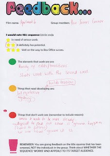

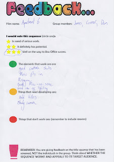
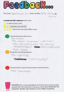
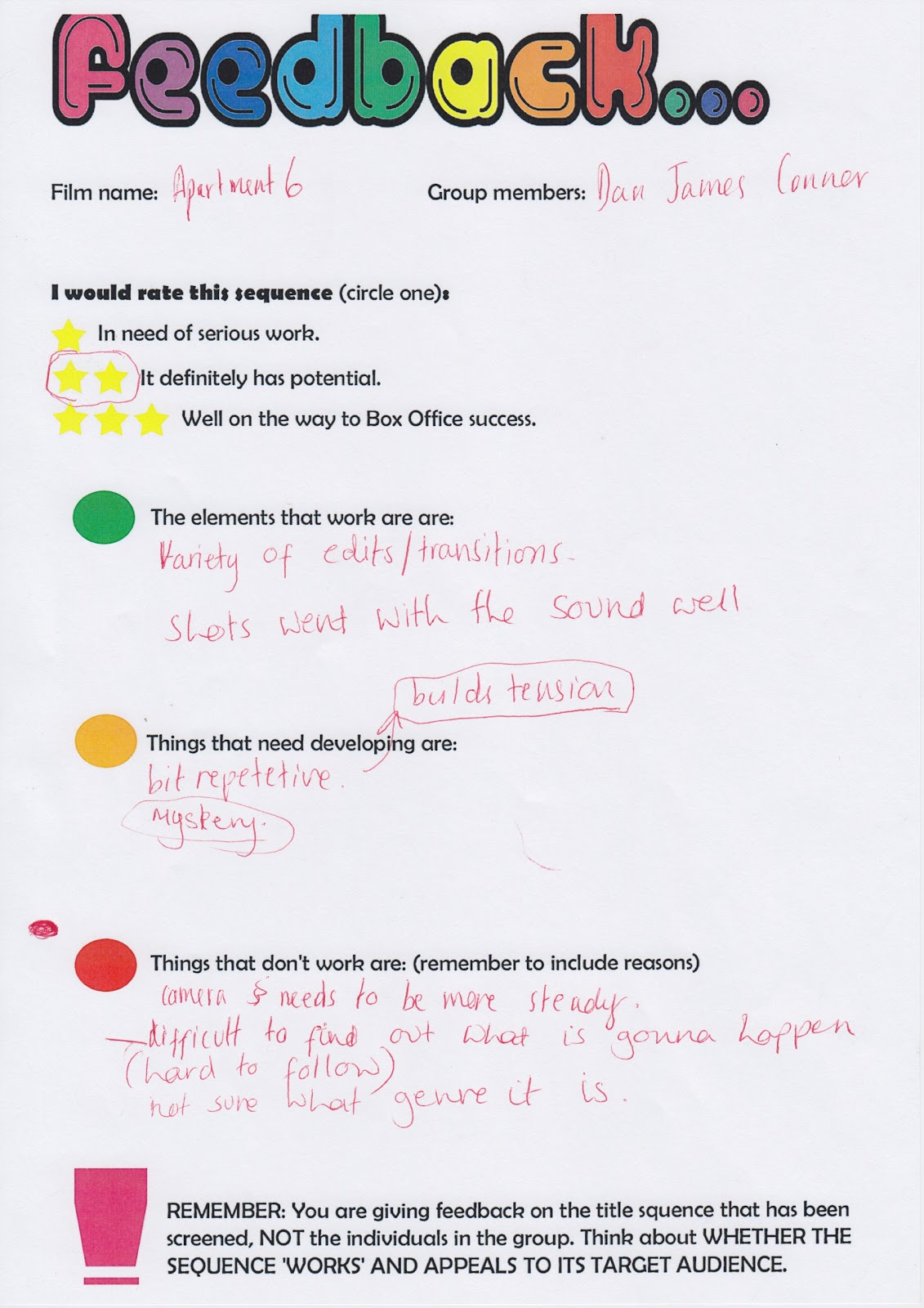
These our the feedback results sheets that our class and teacher gave us after seeing the first screening of our films title sequence. Overall we got : one - 3 star and three - 2stars. Which is what we are very pleased with seeing as we have not finished and still got loads more to added in such as , few more shots , title shots ect.
What went well ?
Overall , the feedback sheet show that what went well was:
- 'The whole idea! '
- The close up of the door number
- The music
- The cuts to the diary flicking pages
- Camerawork
- Misensce
- Enigma
- Lighting
- The tension created throughout
What needs improving:
- The editing doesn't communicate the pace
- Repetitive
- Steady Camera
What doesn't work / needs to be done:
- Titles
- Try to comunicate the genre more.
- Finnish the tittle sequence.
From these feedback , we are overall impressed and thought we have done tremendously well with all the set backs , such as the filming issues to begin with and being behind to make up a whole new film idea , we feel that our hard work has payed off to have such good feedback with a unfinished piece.
Whats next?
We will take into consideration and as the leader of the group , the positive are obviously going to stay in the title sequnce as that what the audience feedback said worked well of course . But in addition , for the feedback that needs 'improving' we will go through the editing once we finished adding the final clips in to communicate the pace more ( Preferably a fast pace build up )
However , the steady camera idea is decided that we cant do nothing about as we cant re film everything again in this amount of time but for the shots that are needed to be added , we will make sure they are steady.
From the feedback that doesn't work : to communicate the genre more , we are going to added a paranormal shot of a door rapidly closing to suggest that their is a ghost in the house to build suspense to the audience at the end of the title sequence. This can show there is 'now way out' and he is possibly going to die in the film. In addition , to communicate the horror genre more we will add a overlap of a more ' horror/spooky ' type music over the heartbeat to give off a more scary atmosphere for the audience. As well , we spoke about the idea of when the title come into place , that paranormal sounds like slams and bangs will appear with it to make the audience feel scared ect to suggest about the haunted apartment. And the verbal feedback from the audience hearing this , once said after hearing the feedback about lack of genre communicate , said that the idea ' will work ' . Finally we are going to be putting in the same work and from the next free lesson , shall be making sure we achieve these targets and when we show our second screening the audience will be happy and we will get more positive feedback from taking in to consideration their feedback.


Title Opening Example
This is the title 'Apartment 6 ' entrance for our film title sequence. We used the idea from our research from youtube at this example someone done . ( http://www.youtube.com/watch?v=r6rrkYPaG4A&safe=active ) . When the actors names and ect come up on this clip , we liked the effect of the names moving around and flashing.We took this idea for when our title appears for our title sequence itself and this our example shown above.
How we done it ?
I opened final cut pro and made blank clip and added a text box and added 'Apartment 6 ' as our text and so far the chosen font ........ Next I copied and pasted that clip a number of times next to each other , and moved the text' Apartment 6' in different locations so the title moves around after each clip ends. But still keeping the font and size the same. In addition , I overlapped two clips to make the font more bold but give off a scary and possessed effect ect just like the mothers handwriting in the diary.

In addition , after playing the footage , we decided with the music that the titles should move around 5 times and in the last shot , it will appear in a larger font across the screen and fade away into the darkness , before the actual title sequence appears. Also , for one of the titles when it moves around for the 2nd and 3rd time , we changed the color of the background font to red to suggest to audience that 'Death' has happened in this apartment wether in the past or for what is going to happen in the film.

- Example of the idea of the text in the red font to suggest 'Death'.
For this title opening scene , we just used the cut effect tool to make it more sharp and fast paced for the audience to build up suspense for the audience .
 Finally , we decided to use the same music that going to played throughout the title sequence 'Awareness 2 ' but for now we used the example of the youtube video we got this idea from music by converting the video to MP3. Over the top , so we have two piece of music playing to sound more scary and so the sounds effect go with the movement of the text. We used the youtube MP3 for the moment to get a ruff idea what it will look like once we found the piece of music to go over the top , however we feel like this works perfect and shall be looking out to find a sound effect just like that for when the texts move in the opening title scene.
The whole footage completed to show what it looks like , just for the opening of our title in final cut pro.
Thursday, 31 January 2013
MAN DOWN!
 Our group has now gone down to just me and Conor as James Barker (shown above) has dropped Media Studies.
Now our fellow groups in our class are in groups of 4 and now we have a disadvantage as our group is now just a double. Being group leader , i mentioned to Conor that me and him need to step up our game and need to work twice as hard as we both need to share James Barkers roles which he had to do and I hope that we both are capable of stepping to the task and producing a good title sequence .
Our group has now gone down to just me and Conor as James Barker (shown above) has dropped Media Studies.
Now our fellow groups in our class are in groups of 4 and now we have a disadvantage as our group is now just a double. Being group leader , i mentioned to Conor that me and him need to step up our game and need to work twice as hard as we both need to share James Barkers roles which he had to do and I hope that we both are capable of stepping to the task and producing a good title sequence .
Wednesday, 30 January 2013
Typography - Audience Research
The overall results from our audience were as follow:
Font number one - 1 vote
Font number two - 6 votes
Font number three - 5 votes
Font number four - 4 votes
Font number five - 10 votes
Font number six - 1 vote
As you can see from our live recording of our results the overall outcome showed that Font number 5 was the favorite. Font number five was called 'True Lies' and we found the font on ' www.dafont.com ' as well as the others.
Before hand we handed out copies of our slide show on 'Apartment 6' so the audience knows what the film is about. We then entered the common room and asked the audience which font looks best for our film idea. Once the results were collected in , we decided to use 'True Lies' the winner as our font of our film.
How we done it?
We hired a flip camera from our media department as well as a tri-pod.
Conor filmed whilst i went around asking the audience on there opinions collecting the results
We handed out copies of our slide show on apartment 6 so the audience know what the film is about and can decide.
Once the first lesson was over , we headed back in and collected the results of these individuals live.
We focused on our target audience which was around our age group however ,we wanted to have a idea of a older audience so we tried to find a teacher to ask but asked the 6form cafe workers.
Overall we are pleased on how this turned out and believed the best font was the winner.
Whats next?
We shall be putting it into our title sequence and shall be seeing what it looks like if it suits our meaning of our film 'Apartment 6 '.
Subscribe to:
Posts (Atom)