Friday, 19 April 2013

Intro


The evaluation of our title sequence. (INTRO)
 We got given the task as a brief, to firstly create a film idea. Then after put into groups we had to pick an idea then go forth and create a title sequence for that film idea. We researched in class about all different types of title sequences beforehand and practiced filming in groups as part of our research and class work all to help us about cinematography. In addition, we created a continuity sequence has a production help on how to edit and not breach the 180 degree rule. These all class tasks played a benefit in making our title sequence, as the skills we learnt helped us use them in our title sequence. For example , the workshops on final cut pro helped us to edit cuts and fade ins and out. And the filming helped us learn and practice shots such a extreme close up and high angle.
Our film name was ‘Apartment 6’  and genre would be a supernatural horror. Which we had to study the codes and conventions for beforehand but here is a brief  into our a film idea.


Evaluation ( Part 1)


In what ways does your media product use, develop or challenge forms and conventions of real media products? (PART 1)
We researched into codes and conventions of title sequence in our lesson and in our free time. In addition , we analyzed title sequences our self such as ‘Zombieland’ ‘SE7EN ‘and other chosen ones for our self ‘Mars Attack’ and ‘Sinster’ was the two I analyzed   which you can read on my blog.
From the research we found out that title sequence create enigmas, like in SE7EN they highlight key clues about what might happen in the film. Once I watched the film , I noticed links from the title sequence to the film such as the filing of his fingerprints. From this concept of creating a enigma for the audience , as a group we decided that we will be doing this also. The enigmas we highlighted in our title sequence was the connotation of the colour red in the title appearing of ‘Apartment 6’ we used a flash of red colour to try and signify death in this apartment whether previously or in the film. In addition, the photos of the family and individuals are all photographs of his blood family which died here as he got put up for adoption. The underline story of his adoption, is shown when a flash appears of a message saying ‘Had to give Daniel away today’. Also, a flash to a diary flicking though pages happens throughout our title sequence. This is actually his mother diary and holds key information  , about his family life which who Daniel never knew or remembers .The apartment is strongly possessed as the pages flick through faster with no one their , and with the door shutting at the end. But also we used close ups of Daniel in the apartment looking around , so you don’t give his identity away. He is a dark figure. The point of the enigma is for the audience to engage into your film as they have questions which they want to be answered. Some are as follow:
·         Whose diary is that?
·         Who is the dark man in the apartment?
·         Who are the people in the photo?
·         Who is Daniel?

Also , another convention we learnt about was that shows are indication of the   setting , for example in a title sequence we carried research on , in ‘Zombieland’ the setting is established as you can tell its in a town in America , through the shops shown  in the background of the chaos in the streets. In addition, the first opening is a man in orange prison clothes which establish the location in America. In our ‘apartment 6 ‘title sequence,  we established the main setting of course to be in the apartment itself. The whole title sequence is filmed with in this location and by the title name , you can tell as the audience that of course the main location is in a apartment. By showing the apartment is dark and the closing of the door and pages flicking by itself , as a audience you establish that this apartment is haunted by some paranormal figure.

The music of horror as to be dark and have a beat to create tension or a climax, for the audience to be scared off. For our title sequence , we used a heart beat throughout to link to show Daniel emotions and feeling of walking around this  apartment. He is scared so therefore and loud heartbeat is used which has a knock on effect onto the audience. The music we used ‘ Awareness’ has a eerie atmosphere to build suspense.

As a group , we didn't want to uses all the title sequences titles which were as followed and the ones highlighted in red show the ones we used. As you can see , we didn't want to use them all because we felt this would drag our title sequence out and we wanted to it be short.
.

Evaluation ( Part 2)

How does your media product represent different social groups? In our film , we have crated the main story character is ‘Daniel’ who is a white male get haunted by his twin brother and finds out the truth about his family that they had a bad up bringing , mainly because of their father ‘Mick’ who was a drunk , abused Daniels mother and brother. In society by the look of the location and apartment , it’s a council based estate apartments , in a terrible area , we tried to link to society stereotypical views of by the look of location and area, families and the people who lived there are terrible people who are lower working class , living in poor conditions. However, Daniel, although this is blood family, managed to not follow his father footsteps and live a good life unfortunately not for his mother and twin brother. This goes against the stereotypical view of that people tend to follow their family footsteps, and if your brought up in these areas. Your tend to turn out like the stereotypical view mentioned before, were as Daniel don’t.

(Part 3)

Evaluation ( Part 4)

Target Audience
We decided that our target audience would be males between 15 – 30 , we chose this ages group as the more younger generation have a thrill of excitement and adrenalin  rush which is what a film gives off. We started with the age 15 as our film will be released around summer or Halloween time , with then teenagers off school and all the excitement with Halloween , teenagers will come and see a film like this to full fill their needs. They would enjoy watching TV with shows such a Darren brown , as they are into the supernatural and scary input that is around in our life.  and going to theme parks as they love a and adrenalin rush. With us target teenagers , we thought it be good way to target them is though social networking sites such as twitter and face book as that is what the world is mainly about now , social networking. With keep advertising on social network sites , it’s a easy way to spread the word of mouth so all teenagers will come and watch the film.
Here is a prezzi about it

Evaluation (Part 5)

How did you attract address your audience?

 We carried out our audience research and actually involved people of our target audience into the production of our film. We carried out research for our film idea , and the typography. If we never done a audience research then we could of made something which our target audience didn't even like , by getting constants feedback and taking into consideration of the audience , we chose what the best results were and went with what they wanted as they will be paying to watch h our film..
Once we pitched our film idea to our group audience to get feed back , the group audience was a group of people who fit into our target audience and we pitched the idea to ensure that it is a good enough film. Once we done this , they made notes and gave us feedback , and what we revived was positive and we took into consideration their opinions for the rest of the production of the film. Also , in what hat we could improve and we ensured we done these ideas if we feel they would work and make our title sequence better , as these are the people who will be paying to see our film. After this first session , we went back to the 'drawing board' and added in our audience feedback. Once we thought of a title sequence idea , we then handed out copies of our title sequence for our target audience  who was the same people,  to see and they loved the idea.
We believed that our target audience would live on adrenalin rushes , with thrill and excitement.So we feel like in our title sequence we have to make the atmosphere for the audience creepy and a climax atmosphere to build tension. In addition , we tried to create this atmosphere through the music piece we wanted to use for our film. And this was our main aim which would appeal to our target audience. From the audience feedback what they thought was successful , was the diary flicking of the pages , they believed this idea indicates what holds the family secrets in the film, and will show the paranormal presence of flicking through the pages too.
Negative feedback as first was our first film idea , once we pitched we got slated by our audince , and no one liked the film and would come and see it. As you can see from our feedback sheets. We had to change the film idea.
We carried out our audience research and actually involved people of our target audience into the production of our film. We carried out research for our film idea , and the typography. If we never done a audience research then we could of made something which our target audience didn't even like , by getting constants feedback and taking into consideration of the audience , we chose what the best results were and went with what they wanted as they will be paying to watch h our film..
Once we pitched our film idea to our group audience to get feed back , the group audience was a group of people who fit into our target audience and we pitched the idea to ensure that it is a good enough film. Once we done this , they made notes and gave us feedback , and what we revived was positive and we took into consideration their opinions for the rest of the production of the film. Also , in what hat we could improve and we ensured we done these ideas if we feel they would work and make our title sequence better , as these are the people who will be paying to see our film. After this first session , we went back to the 'drawing board' and added in our audience feedback. Once we thought of a title sequence idea , we then handed out copies of our title sequence for our target audience  who was the same people,  to see and they loved the idea.


The audience is addressed / attract for our film as we used them as the core of the creation of apartment 6 around them , we involved the target audience with the typography ( video footage on blog ) and on the music , Were we went round collecting their views on which font looks best for our film. In addition , we pitched our film to our audience were we got feedback and took it on board , and gave the audience what they wanted. Once we finished our title sequence , i put it onto my Facebook page for people to see and people chatted me and gave me feedback , which we took on board for improvements , until we final came up with our chosen piece witch they enjoyed and loved. At the end of the day , the audience is what going to be paying to see your film , so we wanted rt involved our target audience as much as possibly so they will pay to see our film as that is what they wanted. We wanted our audience to feel included with the creation of 'Apartnment 6'

Evaluation - ( Part 6 )

Evaluation (Part 6)

Evaluation (Part 6)

Evaluation - ( 7 ) Looking back at your preliminary task, what do you feel that you have learnt in the progression from it to the full product.

Looking back at your preliminary task, what do you feel that you have learnt in the progression from it to the full product? Our preliminary task , was a continuity sequence. Before this , we learnt in class the different types of shots /cinematography there are when filming. And after this is when we got given the continuity sequence to create. However , for this we never done no storyboard or planning , we just looked at the task and went ahead and tried to do it from our minds. This was very time consuming , as we didn't have down a plan which we could follow and from this i learnt that organisation is key to filming. If you have a plan , then from there and if you stick to it, then everything will be far more easier. And i took that into consideration when it came to our coursework on Apartment 6. In addition , on the filming side , this task helped us gain confidence about filming as no-one in my group as done filming before , especially me. Therefore , this task gave me experiences in filming and learning all about the different shot and angles , and giving them a experiment and seeing which looks good and which doesn't. As in the lesson , we learned that different angles and shot can portray message or the audience , like a close up and low angle looking up and some , signifies they are powerful . To learn and experiences all this angels , gave myself and has whole our class , confidence in that we are capable of doing this. With the filming too you got a chance to know how to use and flip camera and tri pod, for when it comes to filimg , you will know and recognize what you need to do. In addition , the editing of the sequence helped us learn the basics of final cut pro , for example the cut tool. I learned how to use all these tool to help shorten video clips and different effect such as fade in and out , for effect to change shots and i felt i was good in this and therefore that why i done the editing for the title sequence .

EVALUATION

http://prezi.com/s2pzfldrspye/present/?auth_key=kue8vev&follow=fe21dnjl3ye7

Wednesday, 17 April 2013

Typography

After our typography lesson , our next task to do was to start looking into typography designs for out title sequence. What we wanted to look for was a font to look 'Distorted ' to go along with the genre of our film and possibly handwritten effect to link in with the 'Mothers Diary'. And bellow are the designs we have liked and was founded on 'www.dafont.com' This font is bold and stands out. It has distorted effects , with the font fading color in places but also , has very slight white gaps which give of a effect its like being scratched and the font is old as the ink is ruined suggesting the horror genre of our film. In addition , the font gives off the idea that it his hand written and the way its been written in a messy looking font , gives off a negative effect about who has written it and that 'Apartment 6' is possibly haunted or something bad has happened as the font gives off a negative thought it about the apartment before you even seen it. hOwever , the downside was the number '6' it never had the number in the same font. So this totally ruined the font. On the otherhand, if this was the chosen font , we could use a similar 6 from a different font just for the number. in this font , it look handwritten , which can help with the link to the mother diary , however , we feel the font is too think and doesn't give off a good scary / creepy effect which we are looking for. in this font in this font in this font in this font

Friday, 1 March 2013

Blog Feedback

Dan - E Sort out the width of the banner! You’re behind – missing typography designs, sound research, audience research, storyboards… Good recording of production process. Appearance of blog needs tidying up & some posts very hard to read – audience profile especially. I have took the feedback on board and up my game and got up to date with the blogging.

Wednesday, 6 February 2013

Ruff Cut Opening of Apartment 6 Title Sequence + Feedback

Firstly , this is the ruff cut of the title sequence that we done  so far that we presented to our class for the first title sequence screening.


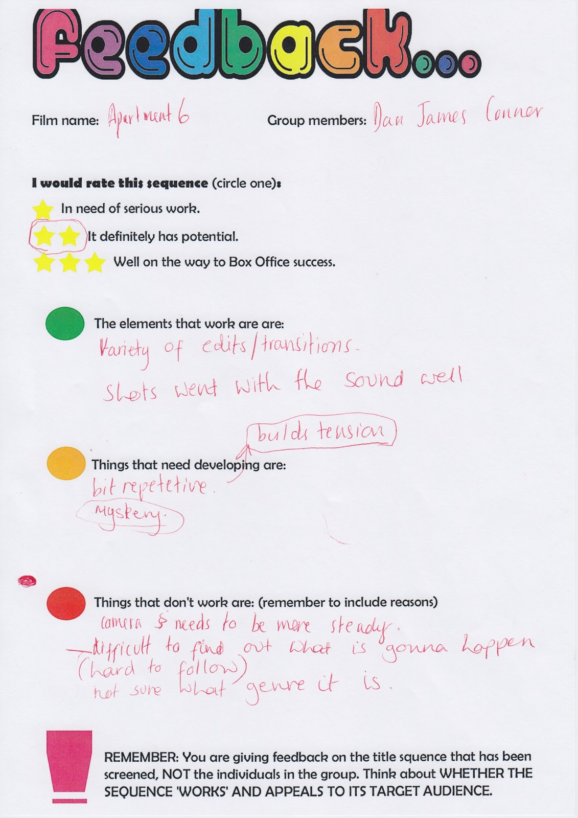
These our the feedback results sheets that our  class and teacher gave us after seeing the first screening of our films title sequence. Overall we got : one - 3 star and three - 2stars. Which is what we are very pleased with seeing as we have not finished and still got loads more to added in such as , few more shots , title shots ect. 

What went well ? 

Overall , the feedback sheet show that what went well was:
  • 'The whole idea! ' 
  • The close up of the door number
  •  The music
  • The cuts to the  diary flicking pages
  • Camerawork
  • Misensce 
  • Enigma 
  • Lighting
  • The tension created throughout 
What needs improving:
  • The editing doesn't communicate the pace
  • Repetitive 
  • Steady Camera
What doesn't work / needs to be done:
  • Titles 
  • Try to comunicate the genre more.
  • Finnish the tittle sequence.  

From these feedback , we are overall impressed and thought we have done tremendously well with all the set backs , such as the filming issues to begin with and being behind to make up a whole new film idea , we feel that our hard work has payed off to have such good feedback with a unfinished piece. 
Whats next? 
We will take into consideration and as the leader of the group , the positive are obviously going to stay in the title sequnce as that what the audience  feedback said worked well of course . But in addition , for the feedback that needs 'improving' we will go through the editing once we finished adding the final clips in to communicate the pace more ( Preferably a fast pace build up ) 
However , the steady camera idea is decided that we cant do nothing about as we cant re film everything again in this amount of time but for the shots that are needed to be added , we will make sure they are steady. 
From the feedback that doesn't work : to communicate the genre more , we are going to added a paranormal shot of a door rapidly closing to suggest that their is a ghost in the house to build suspense to the audience at the end of the title sequence. This can show there  is 'now way out' and he is  possibly going to die in the film. In addition , to communicate the horror genre more we will add a overlap of  a more ' horror/spooky ' type  music over the heartbeat to give off a more scary  atmosphere for the audience. As well , we spoke about the idea of when the title come into place , that paranormal sounds like slams and bangs will appear with it to make the audience feel scared ect to suggest about the haunted apartment. And the verbal feedback from the audience hearing this , once said after hearing the feedback about lack of genre communicate , said that the idea '  will work ' . Finally we are going to be putting in the same work and from the next free lesson , shall be making sure we achieve these targets and when we show our second screening the audience will be happy and we will get more positive feedback from taking in to consideration their feedback. 


Title Opening Example


This is the title 'Apartment 6 ' entrance for our film title sequence. We used the idea from our research from youtube at this example someone done . ( http://www.youtube.com/watch?v=r6rrkYPaG4A&safe=active ) . When the actors names and ect come up on this clip , we liked the effect of the names moving around and flashing.We took this idea for when our title appears for our title sequence itself and this our example shown above.

How we done it ?
I opened final cut pro and made blank clip and added a  text box and added 'Apartment 6 ' as our text and so far the chosen font ........ Next I copied and pasted that clip a number of times next to each other , and moved the text' Apartment 6' in different locations so the title moves around after each clip ends. But still keeping the font and size the same. In addition , I overlapped two clips to make the font more bold but give off a  scary and possessed effect ect just like the mothers handwriting in the diary.

- This is a print screen of two of the titles to show example of overlapping the same text to make it look bold ect. Like mentioned above.

In addition , after playing the footage , we decided with the music that the titles should move around 5 times and in the last shot , it will appear in a larger font across the screen and fade away into the darkness , before the actual title sequence appears. Also , for one of the titles when it moves around for the 2nd and 3rd time , we changed the color of the background font to red to suggest to audience that 'Death' has happened in this apartment wether in the past or for what is going to happen in the film.


 - Example of the idea of the text in the red font to suggest  'Death'. 

For this title opening scene , we just used the cut effect tool to make it more sharp and fast paced for the audience to build up suspense for the audience  .


Finally , we decided to use the same music that going to played throughout the title sequence 'Awareness 2 ' but for now we used the example of the youtube video we got this idea from music by converting the video to MP3. Over the top , so we have two piece of music playing to sound more scary and so the sounds effect go with the movement of the text. We used the youtube MP3 for the moment to get a ruff idea what it will look like once we found the piece of music to go over the top , however we feel like this works perfect and shall be looking out to find a sound effect just like that for when the texts move in the opening title scene.


The whole footage completed  to show what it looks like ,  just for the opening of our title in final cut pro. 

Thursday, 31 January 2013

MAN DOWN!

Our group has now gone down to just me and Conor as James Barker (shown above) has dropped Media Studies. Now our fellow groups in our class are in groups of 4 and now we have a disadvantage as our group is now just a double. Being group leader , i mentioned to Conor that me and him need to step up our game and need to work twice as hard as we both need to share James Barkers roles which he had to do and I hope that we both are capable of stepping to the task and producing a good title sequence .

Wednesday, 30 January 2013

Typography - Audience Research


The overall results from our audience were as follow:

Font number one - 1 vote
Font number two - 6 votes
Font number three - 5 votes 
Font number four - 4 votes
Font number five - 10 votes
Font number six - 1 vote

As you can see from our live recording of our results the overall outcome showed that Font number 5 was the favorite. Font number five was called 'True Lies' and we found the font on ' www.dafont.com ' as well as the others.
Before hand we handed out copies of our slide show on 'Apartment 6' so the audience knows what the film is about. We then entered the common room and asked the audience which font looks best for our film idea. Once the results were collected in , we decided to use 'True Lies' the winner as our font of our film.

How we done it?
We hired a flip camera from our media department as well as a tri-pod.
Conor filmed whilst i went around asking the audience on there opinions collecting the results
We handed out copies of our slide show on apartment 6 so the audience know what the film is about and can decide.
Once the first lesson was over , we headed back in and collected the results of these individuals live.
We focused on our target audience which was around our age group however ,we wanted to have a idea of a older audience so we tried to find a teacher to ask but asked the 6form cafe workers.
Overall we are pleased on how this turned out and believed the best font was the winner.
Whats next?
We shall be  putting it into our title sequence and shall be seeing what it looks like if it suits our meaning of our film 'Apartment 6 '.